
Counters and statistics
The numbers behind your hotel maintenance
How many tickets this month, on which equipment, closed in what time, and by whom. Inara counts what your teams are already doing and hands it back as figures anyone can read. Maintenance is not something you run on gut feel.
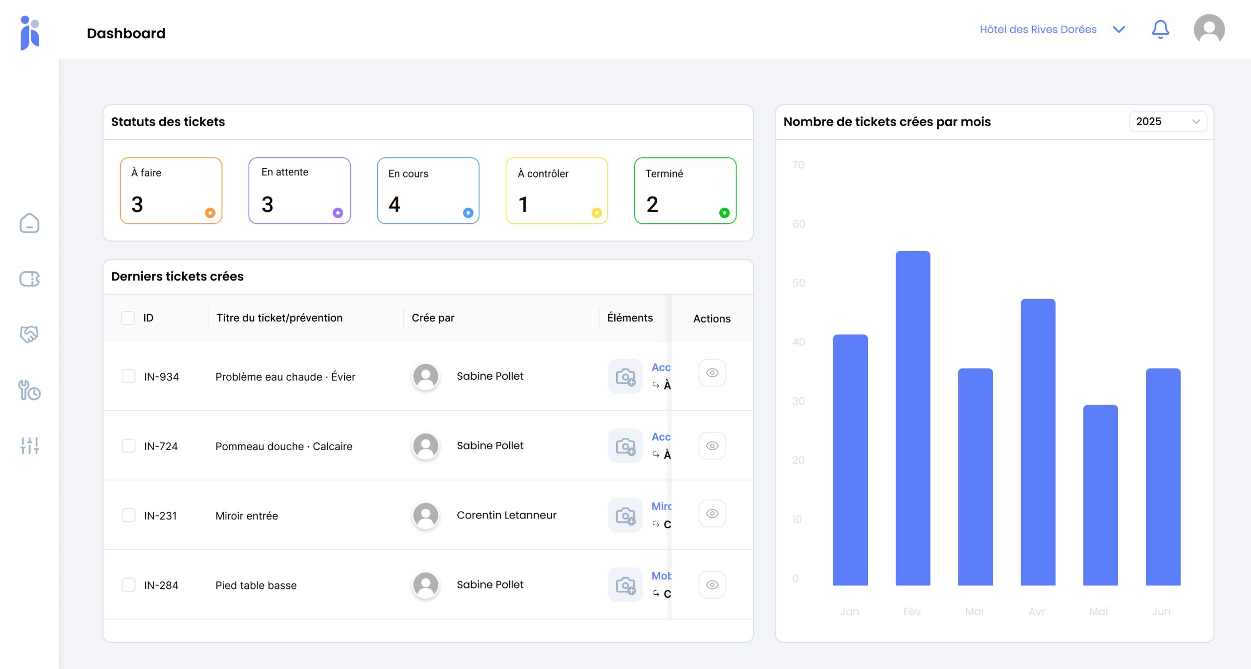
- Volume and trend
- Breakdown by status
- Weight per asset
- Workload by department
A maintenance budget is defended with figures, not with impressions
Every maintenance manager knows the air conditioning on the third floor is trouble. Few can say how many call-outs it has cost this year, or what replacing it would save.
That is the difference between inheriting a budget and negotiating one. Without a costed history, the choice between one more repair and a replacement is made on instinct, and the capital request lands behind those from departments that turn up with spreadsheets. The data exists all the same: it sits in the jobs already carried out. Nobody has simply counted them.
The asset that costs you quietly
Ten small repairs slip by unnoticed where one major breakdown would have forced a decision.
Repair or replace, with nothing to go on
The call gets made on a hunch when nobody has the running total of interventions.
The budget you simply inherit
A capital request without figures always comes second to one that has them.
What you measure
The metrics are built from the tickets your teams raise anyway. There is nothing extra to enter.
-
Volume and the way it moves
How many tickets raised, month by month, and the curve they trace. This is what shows whether one season is heavier than another, and whether preventive work is starting to bring corrective work down.
-
The breakdown by status
To do, in progress, on hold, closed. A pile-up in "on hold" points to parts or to a contractor; a pile-up in "to do" points to headcount.
-
The weight of each asset and each area
Which equipment keeps coming back, which floors eat the most time. This is the view that turns a hunch into an investment case.
-
Workload by department and by person
What is assigned in-house, what goes out to contractors, and how the two split. Useful when weighing up hiring against subcontracting.
From tickets to decisions
Metrics are not declared: they build up as the work is logged.
-
Your teams work as usual
They raise tickets and close them. That is the only data entry, and it already earns its keep elsewhere.
-
The counters fill themselves
Every job feeds the volume, the breakdown by status and the link to an asset and an area.
-
You read the overview
The dashboard gives you the state of play and the trend for the month. Two minutes are enough to tell whether something is drifting.
-
You drill into the detail
A counter that surprises you unfolds down to the jobs behind it. That is where the explanation is.
-
You decide with evidence
Replacing an asset, strengthening on-call cover, changing contractor: the decision rests on what actually happened.
What you gain
A budget you can defend. Capital requests arrive with the history that justifies them.
Costly equipment identified. The running total of small repairs becomes visible.
Bottlenecks spotted early. A pile-up in one status shows up before it turns into delay across the board.
The effect of preventive work, measured. The shift from corrective to planned work reads straight off the curve.
Sharper internal trade-offs. Real workload per department informs the choice between hiring and subcontracting.
Reporting that costs nothing. The figures come out of the work you already log, not out of a spreadsheet kept on the side.
Frequently asked questions
Do we have to enter anything extra to get statistics?
No. The metrics are built from the tickets your teams raise and close anyway. As long as the ticket is attached to the right asset and the right area, the counting follows on its own. That is the best argument there is for getting that link right at the moment the ticket is created.
How long before the figures become useful?
The live counters — what is to do, in progress, on hold — are useful from day one. Trends need a full operating cycle: a season to compare against, a year to see the effect of a preventive maintenance plan.
Can we compare several sites?
Yes, and it is one of the most telling uses across an estate: a site that stands out, in volume or in turnaround time, raises a question worth digging into — headcount, the age of the building, the way the team is organised.
Which indicators should we look at first?
Monthly volume and its trend, the breakdown by status, and the ranking of assets by number of interventions. Those three answer the questions that come up most often: is it getting worse, is something stuck, and what should we act on.
Is it there to appraise technicians?
That is not the recommended use. Workload per person is there to spread the work and to put numbers behind a case for more staff, not to score people. A maintenance team that fears the figures ends up raising the tickets that flatter them.
Can we get the data out for a report?
The dashboards are built for running the day; for an annual report or a board pack, the intervention history is the raw material — every job, with its asset, its area and its dates, ready to be pulled together.
Explore further
The parts of Inara that feed these figures, and where to start.
Let us see what your figures say
Thirty minutes on your equipment, your volume of interventions and what you are trying to demonstrate. No obligation.